The Placemaking Round-Up
A biweekly newsletter with public space news, resources, and opportunities.
The Biweekly Bazaar
A curated dispatch on all things public markets plus the latest announcements from the Market Cities Program.
A biweekly newsletter with public space news, resources, and opportunities.
A curated dispatch on all things public markets plus the latest announcements from the Market Cities Program.
Please note that these Hall of Shame nominations were written in a moment in time (most over a decade ago) and likely have since changed or even been transformed. If the above entry is now great, or still not so great, go ahead and comment below on how it has evolved or nominate it as a great place.
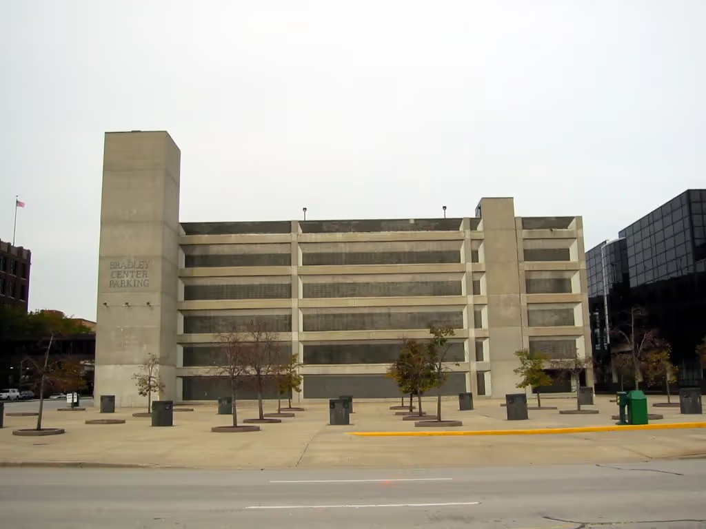
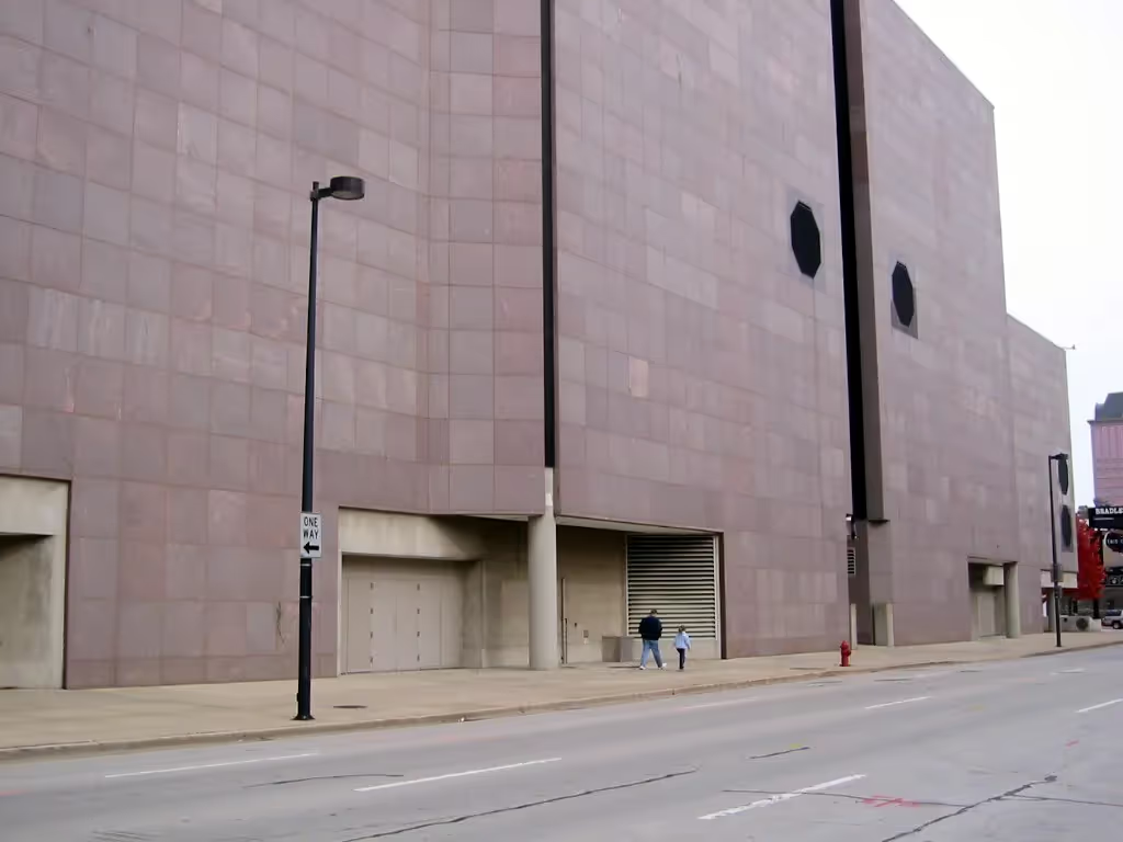
The City of Milwaukee classifies this in the category of institution, educational, public and quasi-public space. It appears that its intended use is downtown public space.

This space is located on a busy urban intersection that is placed on the corner of a large block. It is 22,334 square feet in area and is laid out in a grid pattern. The activities in the surrounding space serve both daytime and nighttime uses. The Bradley Center, a busy center for sports and music events, is located immediately adjacent to the East. Directly across the intersections are a community college and an auditorium.
So what went wrong?
As I have observed this space at different times of the day, on workdays and weekends, even different seasons, it is evident that there are many uses and people that activate the area. Even so, I have never witnessed a single person ever using this space. Not even during the NBA playoffs. An even more frightening observation is that people actually stay on the sidewalk and walk around the space if they are changing directions. They are refusing to enter it even as a shortcut! Unfortunately, I have observed this many times.
The space does not invite interaction. It is completely removed, functionally and experientially, from its surroundings. It is empty and desolate. Though it is located in the midst of active area, it does not give one a sense of security.
This space is next to an entrance to the Bradley Center. What better opportunity could there be for patrons to meet?
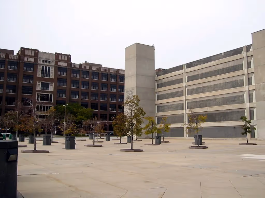
It could be an extension of the Center, an outdoor room, a defined space that is engaging and comfortable. It could be improved in the short term by removing the dead trees and replanting them and the empty box-outs. Adding comfortable seating would greatly improve the space, physically and psychologically. It would give the sense that it is okay to be there. Two sides of the space are next to large, blank walls. At a minimum, the pedestrian level of these walls should be animated by artwork, perhaps large banners of athletes or entertainers who have performed there. Or, it could announce upcoming events. There are many other elements, such as vendors or a small performance space, which could animate the space. Lighting larger features as well as lower lighting at the pedestrian scale could not only provide aesthetic improvement, but also address the perception of it being an unsafe space.
Long-term improvements should continue to work into the finer grain of the space. Defining the streetedge, adding artwork to enliven and add visual interest.
Moving the huge reader board located at the other end of the block corner to this area would be a good way to encourage interaction and let people stay in the space for as long as they like. Presently, the large, tall board is in such a small space, actually the corner of the sidewalk. When the board shows sports events in real time, people gather to watch, but don't stay long because there is not much room to accommodate a large group, and in order to view it, they must tilt their heads back so far that their necks become strained.
The existing curb cuts, which were never closed, should be. It gives the impression that it may be a place to park rather than a place that attracts people. In time, I can envision a small ice-skating rink, with kiosks lining the base of the two dominant walls. Or, a shady spot to sit and read, eat lunch, or meet a friend.
Whether the owner's intent for this space was for public use, or to send a message of "don't look, don't touch" is not clear. If attempts at redemption for this space were unsuccessful, it would fare better to use the space as a development opportunity.
This space has no defined entrances, and lacks human scale. It is located at a busy downtown intersection, with many pedestrians. The level of traffic is not an impediment to pedestrian movement. There are no paths that lead from one place to another. People don't know how to use it, and because of this, they stay on the wide sidewalk to turn the corner. The space tells us to stay out.
This space offers no seating, or any kind of signal that there is any reason to be there. I have never observed anyone try to adapt to this space in any fashion. The space suffers from a lack of identity. It doesn't even have a name or reference. It is poorly maintained and the dead and missing trees add a greater sense of bleakness to the space.
This space has an excellent opportunity to become a destination for all kinds of users, yet they avoid the space altogether. I think that the large, unbounded sense of the space lacks coherence. It seems that nobody cares about it.
There is no context in which to address sociability in this space. Rather, what is profoundly apparent is the absence of any living thing with which to socialize.
*Please note that these Hall of Shame nominations were written in a moment in time (most over a decade ago) and likely have since changed or even been transformed. If the above entry is now great, or still not so great, go ahead and comment below on how it has evolved or nominate it as a great place.